Planning of the Magazine Cover:
Audience:
- Connotations
- Importance of exams
- Revision tips
- Balance between school and social life
- Where you can use your student card and get students discounts
- What to do when you leave college
Audience:
- Students, aged 16-19
- Gender - Both
My Rough Drawn Plan:
 This is a scan of my roughly sketched plan, which was aimed to outline the main aspects that I would definitely use on my cover page. I plan to use DaFont to download my Masthead's font, in Sans - Serif. This is because Sans - Serif consists of rounded edges to the letters, which is appealing to my targeted younger audience. I made sure that I noted down where everything would go, in a rough position; being the masthead, cover-lines, strap-lines, screamers, freebies, splashers, puffs, barcodes, issue number, price, website, main sell and main image. I plan to have a colour scheme that is quite bright and cheerful to attract my youthful audience. Also, I am aiming to make sure that I include all of the main ideas that I have originally put forward for the magazine. This magazine shall be built around my target audience of 16 to 19 year olds, for both boys and girls; because it is for both genders, I must make sure that the colour scheme is not too much for just boys or girls alone.
My Steps to Making this Magazine is:
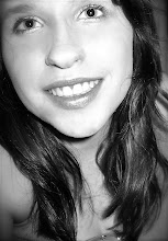
- Use an SLR to take a photo of someone for the main image.
- Photoshop the image so that the subject has got completely clear skin.
- Use photoshop again to add the rest of the items onto the cover page.
- Use Quark Express to create the contents page.
No comments:
Post a Comment