To start with, I decided to make sure that I had all of my photographs taken and out of the way. That way, I wouldn't have to worry about getting them later on, when I would have been well into designing my magazine covers.
Luckily, I happened to know a local band from my town who were prepared to be photographed for my project. I took up the opportunity to do so immediately, because this band were also of my specific targeted genre of rock.
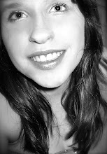
The photo on the left is a sample of the photos which I took. I edited this image on iPhoto on my mac at home.
This is a sample of other photos which I took for the shoot. However, I did not use these in my magazine. When doing this shoot, I made the band play their music while I took photos, because this way, it looked more natural.
This is a sample of other photos which I took for the shoot. However, I did not use these in my magazine. When doing this shoot, I made the band play their music while I took photos, because this way, it looked more natural.
This is a sample of other photos which I took for the shoot. However, I did not use these in my magazine. When doing this shoot, I made the band play their music while I took
photos, because this way, it looked more natural.
I also went to take photos of some of my other friends sitting on a gate. I wanted to have some chilled, laid back photos too, which weren't involving guitars, as I wanted to create a v
arie
ty in the types of shots. The people who I decided to take sitting on a gate were in my c
ategory to attract my target audience. Also, they looked quite 'rebellious,' and therefore coming comfortably under my rock genre.
I then went on to editing these photos in Lightroom.
Here is a print screen on my editing on Lightroom, and it is clear what both the before and after photos looked/now look like.
Deadline for Production:12/2/10 (Date today, 13th January)
= 3 weeks, 6 days until the final deadline.
Thursday 14/1/09 - Research and Planning:4:10pm deadline
Research and planning is to include a detailed analysis of magazines (particularly of my own genre), and also to show an idea of how I want my magazine to be distributed and why. I also am to have included a final audience profile that I wish to have for my magazine, with rough sketches and design ideas, complimented with audience opinions etc.
By Sunday 24/1/09 - [One Week and Four Days] - To have taken all of the photos necessary for the front cover, contents page and double page spreads etc. This needs to have included the organisation of props, setting, camera use, models etc. [For my props, I just need an electrical guitar, and "rock" clothes, the setting is to be against a brick all, I am using my own SLR camera - so I do not need to book one and my model shall be my friend, Edd Cook].
- I then need to have picked out the best photos from the photo shoot and edit them using Photoshop. - Then I need to have written the basic words needed on each spread (being the cover, contents page and double page spreads), and to have added all of the appropriate text boxes and photos etc, to each page. I am going to do this all using Quark Express. By Friday 29/1/09 - [Five Days] - To have finished my front cover completely. Including the text, barcode, informational details, photos etc. - I will complete this in my spare time at home, and in my frees. I shall also complete these in the lessons too. By Wednesday 3/2/09- [Five Days]
- To have finished my contents page completely. Including photos, text and titles.
- I shall complete this in my spare time at home, and in my frees. I shall I also carry on with this my lessons.
By Tuesday 9/2/09 - [Six Days]
- To have completely finished the double page spread; Including the text, text boxes and photos etc.
- I shall complete this in my spare time at home, and in my frees throughout the week. I shall also keep developing it in my lessons throughout the week.
By Friday 12/2/09-DEADLINE DAY FOR PRACTICAL PRODUCTION-[3 days]
- To go over my final practical production, and make sure that everything is neat, correct - spelling-wise and complete overall. These final three days are my last chance to make sure that everything is sorted and finished. I need to make sure that my magazine is suitable for my targeted audience, and keeps to it's genre of rock, as planned. I also need to make sure that the fonts and sizes on my pages are the right size, and consistent where appropriate, and that the language is informal throughout my whole magazine design.
- I also need to have printed out all of the final versions of my practical production, and store them safetly until I need to give them in.
- I shall show my practical production to the target audience that I questioned, when planning for my magazine, and ask them if the final magazine lives up to their expectations.
- Overall, these three days are for polishing off my magazine, to make sure that it has the highest standards possible.
- This timeplan should help me reach the deadline with all of my work finished, at a quick pace, but one that is manageable. _________________________________________________
From Wednesday 17/2/09 - Start developing my evaluation for my practical project, from the questions.
From Monday 1/3/09- [One Week] - Finish off the final stages of my evaluation, making sure that is all of a high standard.
By Friday 5/3/09-DEADLINE DAY FOR EVALUATION-[Five Days] - To hand in the completed evaluation, up to the best standard I can.
I decided to try a different method in getting audience research and responses based on my plans and sketches. Therefore, I chose to use MSN and I sent the plans and sketches to some of my friends who fitted my target audience, and then got them to give me a response to them. This seemed to end up giving me a very detailed audience view. I only asked guys because this is the only gender in my target audience.
In conclusion, I have found that my target audience have agreed with practically everything which I put on my planned sketches, generating a success.
I have picked up that my audience are very visual, so I need to make sure that I do take on their advice and have many photos and images in my pages. I also need to make sure that the fonts are bold and clear.
The last part of my research into magazines consisted of developing my own ideas as to what my own magazine shall look like, roughly. I created a few sketches based on my previous research, in order to make my magazine ideas believable and something that is worth selling to the audience. Naming My Magazine
Firstly, I realised that I needed to gain inspiration for the different aspects of my magazine. I went onto bandnamemaker.com and typed in a random made-up word which my friend gave to use. However, bandnamemaker.com put this word into a random context, mixed with other random words, and I found that this certain word caught my attention: JAMBOORNO. I decided to use this as the name for my magazine, because it sounds quirky, original and attention attracting for my target audience. I also think it matches my specified rock genre quite well too.
My Masthead/Titles Font Ideas
I then went onto Dafont.com to find some font types which would work nicely as the masthead of my magazine.
This is what I found:
I realized that the top font was not all that convenient, because from my previous research findings, and
from my audience research findings, I had realised that my audience like a strong, definite type of font, which is bold and easy to read, but at the same time, eye catching.
Therefore I realised that the second font suited my research findings more, but I still didn't think that it suited my genre style.
Following on from
this, the third font style, I decided would work for a title else where in the magazine, which was not as significant as a mast head,
as I liked this font because it suited my genre nicely.
The fourth font style I decided was suitable for some other part of my magazine, because I have seen that type of style in magazines when I was doing my research.
The fifth and sixth fonts are my favourites because they are bold, but with an 'edge' and they suit the genre of my magazine. However, I noticed that the fifth font looked too much like Kerrang's.
The last two fonts are bold and clear, but I do not think they are striking enough, because there is nothing about them that stands out. I used these as part of my sample collection because they matched the Rolling Stone's magazine font, which is consequently what the majority o
f my target audience said they liked best.
Therefore, my most favourite font was the sixth font style, because it suits the genre of rock, is pretty clear, and pretty catchy.However, as I found that most people liked the Rolling Stone type of font, I am going to make this sixth text 3D, as the Rolling Stone one is, so as to make it up to the most popular expectations.
My Sketched Plans
This is my rough sketch design for my front cover. I have made sure that I included all of the basic conventions such as the masthead, barcode, issue number, date, price, splasher, freebie, mainsell, coverline
and photos. The huge Jamboorno letters are only a mark of how big and wide I want the letters to be. The Jamboorno letters would be in black, and would be in the sixth font that I found in my font research above.
I made sure that I had witty mainsells and titles, because in my research, I realised that wit sells to the audience. I also tried to keep the words to a minimum. Some examples of my attempted witty, short titles are 'The Lowdown on Download' and 'Blink is Back.'
From my other research findings regarding the hue of magazines, I realised that colours have a big impact on the pages and there is almost always a dominant few colours which the whole page is based around, (suited to that particular genre). In this case, I decided to use black, red and yellow as my dominant colours, because they are appealing to my male target audience and also suits my rock genre.
I made the unsigned bands title my main sell because when I asked my target audience if they wanted to see any unsigned bands featured in the magazine, they said yes. So I decided that this could be one of the features, because then I could use my own photos suitably and talk about the unknown bands that are rising. This unsigned band feature would be a one off feature for this magazine brand. But I decided that one double page spread on it would work, because it is not too much, but it is not too little. If I Incorporated this with some major bands in partnership then I think that my audience would not get bored, and would give those who are in unsigned bands some hope. I want to make a magazine which makes a difference on the young people of today.
The title claiming the feature on Download on my plan is going to be written in the same style as Download's original logo is, which is this:
Therefore, I shall use this as the font style, and I think that I might also add the picture behind it for extra effect and originality. The more distinctive the better.
As for the 'Blink is Back' section, I plan to incorporate the Blink 182 logo with the splasher, because the logo creates a rough circle and I think that it would look effective.
This is the sample of the Blink 182 logo, putting 'Blink is Back' in the middle of it would make the splasher's message instantly identifiable.
I have decided that the photo on my front cover shall be of someone leaning forward towards the camera with a guitar. It shall be a guy who has a 'rockstar' look to him in order to match my genre. I am contemplating having some amps in the background too, as well as more band members. He is going to be part of the unsigned feature. I am considering having the background behind the guy in the photo a light grey, which some white/light parts would signify as backing lights, as this could connote stardom.
This is a sketched plan for my contents page.
I used my previous research to bring up a plan for my contents page. I used dominating key colours again, which are going to be red, black and yellow because I found that you are to match the key dominating colours with the front cover.
I also noted that every single contents page starts with a 'THIS WEEK' title above all of the sectioned topics. I decided to incorporate what seems to be the most important features for my audience. Also, there is almost always an interview section, reviews section, features section, competitions section and latest release section. Therefore I put these topics as my subheading for my magazine's contents page. Also, from my audience research, I found that these topics are relevant to what they want in a magazine like this.
I have also noted that many magazine contents pages have an editors section which is where the editor writes a small paragraph about the latest magazine edition. Therefore, I included it in my contents.
Another similarity which many magazine contents pages have, be it music or not, is that they have subscription adverts on all of their pages. Therefore, I plan to have a subscription advert on mine, at the bottom, so it does not take too much attention away from the rest of the page.
Many magazines also have a huge photo of the main feature, repeated as from the front cover, so I have copied this example too. I also added an image underneath for more visual effect too.
This is a rough sketch that I made for my double spread:
This rough layout structure is all I need for my plan, because I can fill up the rest of the gaps with words and photos.
From my previous research, I have realised that all of the language should be informal in order to attract my young audience.
The title needs to be big, bold and I am going to put it on a black background as I have labeled on the plan, in order to have a huge eye catching title, to make the audience read on. I have noticed that other magazines have quotes across their photos and pages, so I too, have done that.
The writing is also always in columns on double page spreads and the writing is always no more than size 7.
I have Incorporated loads of images on my double page spread, because that is what I have found the other magazines do too, as it makes it visually dynamic.
I managed to come up with a mood board that summarised the main findings of my target audience by gathering all of the key things that a rock music lover would be sterotypicalised with. I realised the pattern of the target audience which rock/music magazines were aimed at; this being teenagers and young adults, mainly for men. I adopted this target audience for my own magazine. With this in mind, I then went on to develop a mood board consisting of a variety of things from film preferences to that type of audience's lifestyle, in order to see what I should feature in my own magazine, regarding adverts, topics, font types etc.
I have already summarised a lot of points that I had found when researching magazines, but I have looked back and found more facts referring to rock magazine appearances: Overall:
The audience like to have slang, such as OMG
The language is informal
The people in the photographs are staged, generally in a studio
The dominating photo on each page is generally what the feature topic of that particular page is about. On the front cover, the main photo is what the magazine's most important feature is overall
The photo of a band/singer tends to dominate each page
The Front Cover:
The dominant colours are mostly red and black
The mastheads, splashes, subheadings, cover lines (etc) all have a sans-serif font, which is where the letters are all rounded
The masthead has ragged letters and is normally in bold, grimy colours, such as black
There is at least one splasher on each front cover, but no more than three
On the covers, these magazines often have something advertised which is free with the magazine
There are often quotes on the front covers, made by the artists and bands
Every front cover has a price, website, date and issue number
The Double Page Spreads:
There is always a key colour on each page, which everything is based around
On some double page spreads, some photos appear to have a rough cut-out effect
The Contents Pages:
Subscription adverts are used on the contents pages
A lot of the time, there is a 'THIS WEEK' title above all the topic titles
The photos on the contents pages are sized in relevance in order of importance to how much of a feature they are in the magazine
This is my mood board:
I went around asking people about my mood board by showing them. I mainly asked teenage/young adult males, because this is my prime target audience. I asked them a set number of questions which developed from each answer, although I had a prime idea of the types of questions that I wanted to ask. I tried to film each person who I asked, for reference.
My Live Interviewing Results:
From these live interviews, I started to get a rough idea of what my target audience would like, however, I felt that if I had a written the questions for people to write the answer to, then it would be more successful, because people would have more time to think about their answers. Therefore, I decided to post my mood board onto my Facebook with a set of questions underneath, in order get as many people as possible to comment on my mood board, answering the questions. This method of audience research, I found was more of a success then live interviews.
My Facebook Results:
These following pictures are print screens of my audience research regarding my mood board on Facebook:
This is a long shot of the overall page in which I posted my mood board.
This is a more zoomed in version of the mood board on Facebook.
The many blue tags are all of the people I tagged in this image, because...
a) That way they would notice my mood board
b) I only tagged people who fitted in my target audience category, so as to get the right audience analyzing my mood board.
The following are the zoomed in screen prints of the answers that my target audience answered to the questions that I gave them. These questions were:
1) What type of font attracts you the most?
2) Would you like to see anything about unsigned bands in the magazine? Or just famous ones?
3) Would you like to see any features about any of the TV programmes? Such as Skins or Scrubs? Or just MTV etc?
4) What types of things would you like to see advertised in the magazine?
5) Would you like information about festivals such as Download?
6) Is there anything else you would like to see in the magazine?
7) Do you think that this mood board appeals to both guys and girls? Or just guys?
From this information from the answers which my target audience has given me, I have found the following results:
*The numbers are the amounts of people who said the particular thing.
"def list of gigs.. new talent too. and a vox box (the consumers opinions) people like to be heard!"
5) Would you like information about festivals such as Download?
-Yes = 20
-No = 0
I particularly liked the comment:
"Yeah, also maybe like an offer or something for people that buy the magazine. like something free at the festival because everything is so expensive there."
6) Is there anything else you would like to see in the magazine?
-No more ideas = 0
-Crosswords = 1
-Fashion = 2
-Competitions = 2
-Interviews with bands = 5
-Where artists buy their clothes = 1
-Shops no one has heard of = 1
I particularly liked the comment:
"what about fashion..targeted to music followers.. would also increase the chances of getting companies to advertise their merchandise!n more revenue for the magazine.. would increse the yeild!"
7) Do you think that this mood board appeals to both guys and girls? Or just guys?
This is my target audience's profile. I have included everything, ranging from their personality, gender, age, likes and dislikes and job statuses etc. I have covered everything in order to ensure that I am certain about every single detail which I need to make my magazine successful.
Lifestyle: -Part of the younger generation -Know facts about music -Radicalist -Student of some level -Live life to the full -Post-modernist -Enjoy the outside -Fun seeker -Not afraid to take risks -Like to express individuality -Do not care what people think of them -Free spirited -Having a family in the future is not a priority -Personality is not completely mature -Musical appreciation Age Range: Teens to young adults = 15 - 25 years Sex: Mainly men
Dress Sense:Low waist skinny/baggy jeans, converses/DC's/Vans, leather jackets, studded belts/ wristbands, T-shirts, hoodies Appearance:Piercings (particularly eyebrows and ears), stretchers, wristbands, beanies/backward baseball caps, side fringes, hair gel
Job:Most likely a full or part time student, but also, as referred on the Jicnars scale: my audience would be at D, C2, C1 and B D = Semi and unskilled manual workers - eg, bank clerk C2 = Skilled manual workers - eg, plumber C1 = Supervisory, clerical, junior administrative or professional - eg, labourer B = Intermediate managerial or professional - eg, middle manager Therefore, the target audience would be for: Middle class Skilled working class Working class Lower middle class Income Range:would be between £10,000 - £50,000+ a year
Social Values:Post-modernists, which is 'to have, to be, to play'
Music Prefrences: Fall out boy, Blink 182, Sum41, System of a Down, Green Day, Dead Poetic, Nickelback, Kid Rock, Evanesence, Guns 'N' Roses, 3 Doors Down, Coldplay, Good Charlotte, Simple Plan, The Fray, The Calling, Skillet, Avril Lavigne, Angels and Airwaves, P!nk, Queen, BonJovi
Film Prefrences: The Hangover, American Pie, District 9, Flight Plan, School of Rock, Saw, Texas Chain Saw Massacure, Scary Movie, Borat, Ali G, The Others, Severn Pounds, Rat Race, Johnny English
TV Programme Prefrences:Skins, Scrubs, My Name is Earl, The Big Bang Theory, Friends, MTV, VH1, E4, BBC, Film4
Radio Prefrences:Kerrang, BRMB, Total Rock, Rock FM, Wyvern
I have made plans initially from the most basic concepts of research that I have carried out.
I plan to create a magazine based on a Rock genre, due to the fact that there are so many artists within this genre which could be included.
This means that the target audience would be for teenagers and young adults, of ages 15 - 25.
Following on from my research that I have carried out previously, I plan to take certain aspects that make different magazine front covers unique, and manipulate them into my own idea, though carrying out the same concept.
Therefore, I can imagine having a colour scheme consisting of colours which are not bright. I want the colours to compliment each other so that I can achieve a complete overall look.
The colours are to mainly be red and black.
I am going to use magazines such as Q, ART ROCK, KERRANG and NME to give me inspiration regarding my own magazine. This is because these magazines have the genre and style which I intend to use for my own magazine.
In every magazine that I have previously researched, I have realised that they all have mastheads, cover lines, splashes, puffs and main sells etc. These are the basic conventions of magazines.
This magazine is mainly targeted at men, because it is a pure rock magazine, and according to my research, men are the main target audience for this genre.
The main difference between major and independent distribution strategies is the distinctive amount of money that needs to be saved by the companies, when distributing.
Major distribution strategies include the use of partnerships locally, nationally and internationally. They will use major marketing strategies of merchandise and items, as well as using the new generation of the Internet (media 2.0), to do simple, cheap things such as viral marketing to promote themselves. Viral marketing also proves cost effective so that the major companies don’t have to worry about spending loads of money on the thousands of prints that they do for every magazine. Major distribution strategies consist of a broad array of aspects to get involved with its audience as much as possible.
This links to independent distribution strategies, where they also rely on the internet to produce things for their audiences at a cheaper cost (mainly because the internet does not involve any inks or printing :///and it does not cost to use the internet). Viral marketing is also what independent companies do to distribute because it is a fast way to get popular. Independent distribution strategies may also reply on sources such as newspapers, books and small radio stations.
However, major distribution strategies use convergence and synchronisation to benefit their own companies and gain more of an audience by spreading themselves across the TV and radio magazines as well. Frontline, for example, is one of the four major distributors for the magazine industry. Bauer is one of the main three publishers in the UK and is a huge private publisher, ranging mostly throughout Europe. After having a sure success from the breakout of the ‘Take a Break’ woman’s magazine which sells millions, and with success from the magazine ‘Bella’ beforehand, the owner spread to TVQuick and TVChoice in the 1990’s. It then went to Emap’s Radio, resulting in so much of a wide spread company that the name was changed to Bauer Radio and Media regarding its new television and radio status.
Independent distributing companies rely on small corner shops and online subscriptions to sell their magazines. However, major distributing companies can provide postal subscriptions and are able to sell their magazines in both small newspaper shops, to major leading stores, such as Asda, Tesco, Morrisons, WHSmiths etc. The graph here shows the examples of this, and gives reason as to how these mainstream magazines can distribute so successfully.
I found this graph of this link:http://www.frontline.ltd.uk/frontline/about/supply_chain.html
Major labels mainly has an audience profile which consists of young adults. Kerrang, for example, is a mainstream which has an audience profile for the:
“Individually minded, independent of thought and musically experienced, an audience defined by attitude, passion and loyalty.”
– Which is a quote from the website http://www.bauermedia.co.uk/Brands/Kerrang/
This would affect the way that the magazine is distributed, because it should be distributed in areas which give you/consist of musical experience, has attitude and gives indie music. Following this, Kerrang is broadcasted on the TV (on Sky and Virgin Media), it also has its own radio station (called Kerrang! Radio) and obviously, has its own magazine. This is convergence.
However, independent companies such as Vice has a very opposite approach to what mainstream companies such as Kerrang has. In my opinion, the audience type for this magazine would be for for an older audience, average people, having an interest in many different things, intelligent and middle class. Consequently, they are available in smaller retail places, such as Urban Fitters, Size or Retro Bizarre (as an example of some in Birmingham).
In Conclusion to this Research [IN REGARDS TO MY MAGAZINE]
My audience profile:
You are part of the younger generation, know your facts about music, like to think of yourself as a radicalist, most likely a student of some aspect and you enjoy living life to the full, most likely being a post-modernist.
I shall use a major distributing company for my magazine, because it is of one of the mainstream genres and shall be most successful if it is distributed through a major company.
Therefore I shall use leading stores to sell my magazines, such as Asda, Morrisons, Tescos, WHSmiths etc.
I shall also use online platforms, (making use of media 2.0). Therefore I shall use facebook, mypace and twitter to connect to my audience, because these social networking sites are very useful for viral marketing, as that saves ink and printing costs. It also speeds up the promoting process.
I also want to distribute my magazine on the TV and radio to ensure a broad basis in order to reach as wider audience as possible.


 Here is a print screen on my editing on Lightroom, and it is clear what both the before and after photos looked/now look like.


