Naming My Magazine
Firstly, I realised that I needed to gain inspiration for the different aspects of my magazine.
I went onto bandnamemaker.com and typed in a random made-up word which my friend gave to use. However, bandnamemaker.com put this word into a random context, mixed with other random words, and I found that this certain word caught my attention: JAMBOORNO. I decided to use this as the name for my magazine, because it sounds quirky, original and attention attracting for my target audience. I also think it matches my specified rock genre quite well too.
My Masthead/Titles Font Ideas
I then went onto Dafont.com to find some font types which would work nicely as the masthead of my magazine.
This is what I found: 

From my other research findings regarding the hue of magazines, I realised that colours have a big impact on the pages and there is almost always a dominant few colours which the whole page is based around, (suited to that particular genre). In this case, I decided to use black, red and yellow as my dominant colours, because they are appealing to my male target audience and also suits my rock genre.
I made the unsigned bands title my main sell because when I asked my target audience if they wanted to see any unsigned bands featured in the magazine, they said yes. So I decided that this could be one of the features, because then I could use my own photos suitably and talk about the unknown bands that are rising. This unsigned band feature would be a one off feature for this magazine brand. But I decided that one double page spread on it would work, because it is not too much, but it is not too little. If I Incorporated this with some major bands in partnership then I think that my audience would not get bored, and would give those who are in unsigned bands some hope. I want to make a magazine which makes a difference on the young people of today.
The title claiming the feature on Download on my plan is going to be written in the same style as Download's original logo is, which is this:
 Therefore, I shall use this as the font style, and I think that I might also add the picture behind it for extra effect and originality. The more distinctive the better.
As for the 'Blink is Back' section, I plan to incorporate the Blink 182 logo with the splasher, because the logo creates a rough circle and I think that it would look effective.
 This is the sample of the Blink 182 logo, putting 'Blink is Back' in the middle of it would make the splasher's message instantly identifiable.
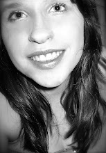
I have decided that the photo on my front cover shall be of someone leaning forward towards the camera with a guitar. It shall be a guy who has a 'rockstar' look to him in order to match my genre. I am contemplating having some amps in the background too, as well as more band members. He is going to be part of the unsigned feature. I am considering having the background behind the guy in the photo a light grey, which some white/light parts would signify as backing lights, as this could connote stardom.
This is a sketched plan for my contents page.
 I used my previous research to bring up a plan for my contents page. I used dominating key colours again, which are going to be red, black and yellow because I found that you are to match the key dominating colours with the front cover.
I also noted that every single contents page starts with a 'THIS WEEK' title above all of the sectioned topics. I decided to incorporate what seems to be the most important features for my audience. Also, there is almost always an interview section, reviews section, features section, competitions section and latest release section. Therefore I put these topics as my subheading for my magazine's contents page. Also, from my audience research, I found that these topics are relevant to what they want in a magazine like this.
I have also noted that many magazine contents pages have an editors section which is where the editor writes a small paragraph about the latest magazine edition. Therefore, I included it in my contents.
Another similarity which many magazine contents pages have, be it music or not, is that they have subscription adverts on all of their pages. Therefore, I plan to have a subscription advert on mine, at the bottom, so it does not take too much attention away from the rest of the page.
Many magazines also have a huge photo of the main feature, repeated as from the front cover, so I have copied this example too. I also added an image underneath for more visual effect too.
This is a rough sketch that I made for my double spread:
 This rough layout structure is all I need for my plan, because I can fill up the rest of the gaps with words and photos.
I realized that the top font was not all that convenient, because from my previous research findings, and
from my audience research findings, I had realised that my audience like a strong, definite type of font, which is bold and easy to read, but at the same time, eye catching.
Therefore I realised that the second font suited my research findings more, but I still didn't think that it suited my genre style.
Following on from
this, the third font style, I decided would work for a title else where in the magazine, which was not as significant as a mast head,
as I liked this font because it suited my genre nicely.
The fourth font style I decided was suitable for some other part of my magazine, because I have seen that type of style in magazines when I was doing my research.
The fifth and sixth fonts are my favourites because they are bold, but with an 'edge' and they suit the genre of my magazine. However, I noticed that the fifth font looked too much like Kerrang's.
The last two fonts are bold and clear, but I do not think they are striking enough, because there is nothing about them that stands out. I used these as part of my sample collection because they matched the Rolling Stone's magazine font, which is consequently what the majority o
The last two fonts are bold and clear, but I do not think they are striking enough, because there is nothing about them that stands out. I used these as part of my sample collection because they matched the Rolling Stone's magazine font, which is consequently what the majority o
f my target audience said they liked best.
Therefore, my most favourite font was the sixth font style, because it suits the genre of rock, is pretty clear, and pretty catchy. However, as I found that most people liked the Rolling Stone type of font, I am going to make this sixth text 3D, as the Rolling Stone one is, so as to make it up to the most popular expectations.
My Sketched Plans
This is my rough sketch design for my front cover. I have made sure that I included all of the basic conventions such as the masthead, barcode, issue number, date, price, splasher, freebie, mainsell, coverline
and photos.
The huge Jamboorno letters are only a mark of how big and wide I want the letters to be. The Jamboorno letters would be in black, and would be in the sixth font that I found in my font research above.
I made sure that I had witty mainsells and titles, because in my research, I realised that wit sells to the audience. I also tried to keep the words to a minimum. Some examples of my attempted witty, short titles are 'The Lowdown on Download' and 'Blink is Back.'
From my other research findings regarding the hue of magazines, I realised that colours have a big impact on the pages and there is almost always a dominant few colours which the whole page is based around, (suited to that particular genre). In this case, I decided to use black, red and yellow as my dominant colours, because they are appealing to my male target audience and also suits my rock genre.
I made the unsigned bands title my main sell because when I asked my target audience if they wanted to see any unsigned bands featured in the magazine, they said yes. So I decided that this could be one of the features, because then I could use my own photos suitably and talk about the unknown bands that are rising. This unsigned band feature would be a one off feature for this magazine brand. But I decided that one double page spread on it would work, because it is not too much, but it is not too little. If I Incorporated this with some major bands in partnership then I think that my audience would not get bored, and would give those who are in unsigned bands some hope. I want to make a magazine which makes a difference on the young people of today.
The title claiming the feature on Download on my plan is going to be written in the same style as Download's original logo is, which is this:
As for the 'Blink is Back' section, I plan to incorporate the Blink 182 logo with the splasher, because the logo creates a rough circle and I think that it would look effective.
 This is the sample of the Blink 182 logo, putting 'Blink is Back' in the middle of it would make the splasher's message instantly identifiable.
I have decided that the photo on my front cover shall be of someone leaning forward towards the camera with a guitar. It shall be a guy who has a 'rockstar' look to him in order to match my genre. I am contemplating having some amps in the background too, as well as more band members. He is going to be part of the unsigned feature. I am considering having the background behind the guy in the photo a light grey, which some white/light parts would signify as backing lights, as this could connote stardom.
This is a sketched plan for my contents page.
 I used my previous research to bring up a plan for my contents page. I used dominating key colours again, which are going to be red, black and yellow because I found that you are to match the key dominating colours with the front cover.
I also noted that every single contents page starts with a 'THIS WEEK' title above all of the sectioned topics. I decided to incorporate what seems to be the most important features for my audience. Also, there is almost always an interview section, reviews section, features section, competitions section and latest release section. Therefore I put these topics as my subheading for my magazine's contents page. Also, from my audience research, I found that these topics are relevant to what they want in a magazine like this.
I have also noted that many magazine contents pages have an editors section which is where the editor writes a small paragraph about the latest magazine edition. Therefore, I included it in my contents.
Another similarity which many magazine contents pages have, be it music or not, is that they have subscription adverts on all of their pages. Therefore, I plan to have a subscription advert on mine, at the bottom, so it does not take too much attention away from the rest of the page.
Many magazines also have a huge photo of the main feature, repeated as from the front cover, so I have copied this example too. I also added an image underneath for more visual effect too.
This is a rough sketch that I made for my double spread:
 This rough layout structure is all I need for my plan, because I can fill up the rest of the gaps with words and photos.
- From my previous research, I have realised that all of the language should be informal in order to attract my young audience.
- The title needs to be big, bold and I am going to put it on a black background as I have labeled on the plan, in order to have a huge eye catching title, to make the audience read on. I have noticed that other magazines have quotes across their photos and pages, so I too, have done that.
- The writing is also always in columns on double page spreads and the writing is always no more than size 7.
- I have Incorporated loads of images on my double page spread, because that is what I have found the other magazines do too, as it makes it visually dynamic.
No comments:
Post a Comment