"In what ways does your media product use, develop or challenge forms and conventions of real media products?"
My magazine is not very different from other student magazines, because in my opinion, no matter who the target audience is (regarding age or gender), it is still aimed for the students - which will only be a certain age range. Therefore, the main-sells and cover-lines are always going to cover the same general aspects.
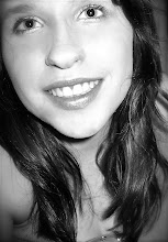
My main image was taken by the person who I was working with on this project. She took a photo of me because I am, myself a student, and therefore represent the audience (of students) who would look at this magazine. The fact that I am smiling in this photo connotes that being a student is enjoyable and rewarding. The masthead sign denotes as a large San Serif font, connoting as it being approachable for my younger audience because it appears 'less formal.' My main sell denotes as bright, bold, contrasting black and pink capital letters; confidently stating 'WHAT NEXT?' This connotes as the most important part of this issue's magazine of which students of all levels should be constantly thinking about in the back of their minds, signifying as to why it is made to appear so important on this cover.
In the making of this magazine, some forms and conventions were challenged, but eventually we tried to make it look as realistic as possible in comparison with previous student magazines that I researched beforehand. I had to make sure that the main image was a distinctive close up and that the proportions of the text and features were balanced out correctly, with the use of colour also kept considered on a constant basis.
No comments:
Post a Comment