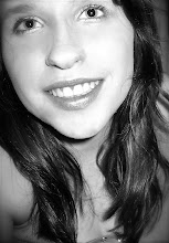
As previously mentioned, I attracted my target audience of students by adapting the features on the cover to suit their appeal. For example, I used a Sans Serif font for the mast head to give an informal feel. The main image (which is of me taken by my project partner) is seen by the audience as a student, just like them - this makes it identifiable to the audience and more personal to them. Also, I used a variety of bright colours which stand out against each other, because youthful people like boldness and brightness.
No comments:
Post a Comment