
Magazine One
The audience for this magazine is for people who have left college or 6th form, going onto furtheir education, however, it is clearly specifically aimed at male students. We know this by the fact that the main sell is of a young woman who is wearing a very revealing shirt andhe model is holding the color of the shirt in a seductive way. The subheadings are all relevant towards student life. The magazine is in green and white, which portrays the theme of St Patricks Day, which this magazine is about.
Magazine Two
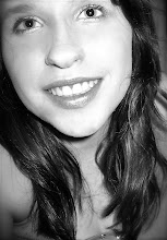
The masthead denotes a San-serif font which connotes directness and approachableness. The main-sell is of a close-up photograph of a girl who is smiling and looking very happy. This could connote going abroad to work is a good choice, portraying the thought that travelling to work could bring you enjoyable success. It makes it clear that it is a specified magazine for working abroad, as the subheading states so, this adds extra information of the magazine. Even though the cover has a pretty plain feel about it, it still gets it point across because the subheadings naming various countries are in a bold, sans-serif font - grasping attention from readers. The website at the bottom is in bubble writing, which attracts the attention of the readers and provides more inofrmation on the magazine. This dosnt really match the rest of the writing on the page as it has a sense of childness, which isnt relevant to a 'student' magazine. This denotes a magazine aimed for Indian students, helping them find places to go to in the world of work.
 Magazine Three
The magazine is a montage of various images, this connotes randomness and a spontanous theme - which is identifiable to the way many students live. It also denotes as very vibrant and colourful. The masthead is the boldest thing on the page that stands out because of the contrasting white writing over black, along with the screamer that's at the end of the magazine's title: 'Tell!' The splashes add interaction and visual aid to the reader, and has images that relates to what is being said. The puff is in a bright cheerfull colour with a catchy feel to it 'REALITY BITES BACK' it is also in capitals this draws more attention on it, as well as the fact that pink and black contrast together, to make each point stand out.


 Magazine Three
No comments:
Post a Comment